
The product promises depth: hundreds of exercises on one narrow grammar topic. Depth has an obvious failure mode. Forty exercises can easily feel like the same exercise forty times, and a learner who feels that will stop, usually without saying why.
Two questions follow. Are these exercises genuinely different? And even if they are, does the order a learner meets them in make them feel repetitive? A learner never sees a similarity matrix. A learner sees a sequence.
Embeddings answered the wrong question
The obvious first step was off-the-shelf sentence embeddings. They failed in two directions. Two exercises about travel that practise different grammar came out as very similar. Two exercises about different topics that use the same sentence frame and the same answer pattern came out as different. For a learner it’s exactly the other way round: the travel pair feels varied, and the second pair feels like a repeat.
So the similarity score had to describe what “repetitive” means for this product. It ended up with four parts, each normalised and weighted before comparing exercises:
- Words in the filled-in text, which catches the same vocabulary field coming up again and again.
- Character patterns of the correct answers, which catches the same endings drilled with different words around them.
- Structure: gap count, text and answer length, where the gaps sit.
- Part-of-speech patterns from spaCy, which catches the same sentence scaffold dressed in new vocabulary.
The exact weights matter less than the decision behind them: similarity here is a product definition, not a generic NLP quantity.
Making a score usable
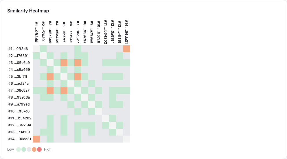
A section with 40 exercises has 780 pairs, and a list of 780 numbers is not something anyone can act on. The admin area shows the same data at three zoom levels: a heatmap for where the overlap is dense, a dendrogram for whether it forms families of near-variants, and a side-by-side view to decide whether a close pair is truly redundant or just related.

The metric that lied to me
To compare orderings I needed a single number per section. My first one divided the average similarity of neighbouring exercises by the average similarity of all pairs. Lower meant better spacing. It looked sensible and it moved in the right direction after reordering.
Then I added a batch of new exercises to a section without changing anything about the order, and the score changed anyway. The ratio depended on how many exercises there were and how similar the new ones were to everything else, not only on the order. A metric that improves when nothing has improved is worse than no metric, because you believe it.
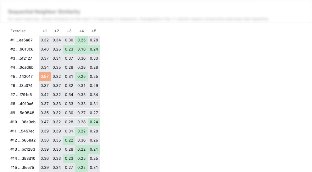
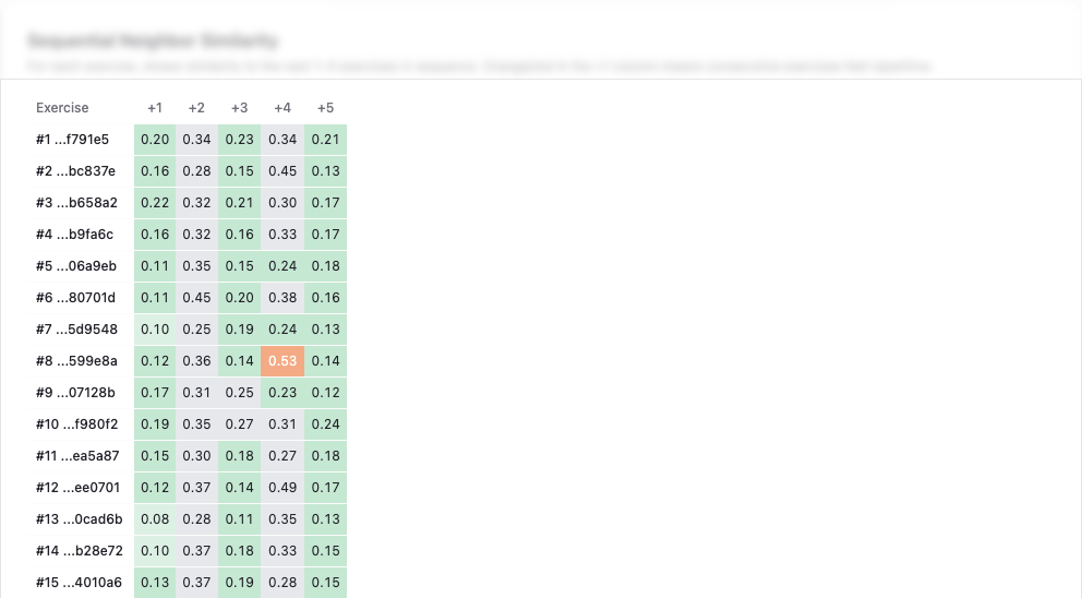
The replacement asks a rank question instead: where do the neighbouring pairs sit among all pairs in the section, from least to most similar? If neighbours come from the dissimilar end, the order is good, whatever the section’s size. A second measure looks a few steps ahead, weighting the next exercise most and the fifth one least, because a learner feels the immediate repeat most.
Reordering without breaking anyone’s place
The ordering itself is a classic heuristic: start with a greedy sequence that always picks the least similar next exercise, then improve it with 2-opt swaps until no swap helps. It’s quick and it isn’t optimal, which is fine. The interesting part is the constraint.
Learners move through a section in order, and their progress is stored as the number of the last exercise they completed. Reorder the whole section and a returning learner might repeat something or skip something. So the rule is: anything at least one learner has completed stays where it is.
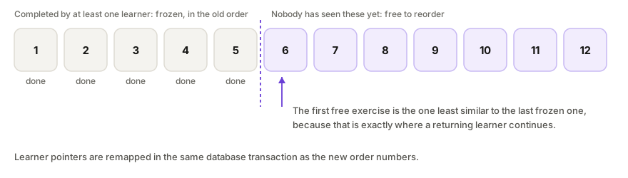
One detail sits at the boundary. The first exercise after the frozen part is chosen to be as unlike the last frozen one as possible, because that is exactly where a returning learner continues. When a reorder does renumber exercises, every learner’s progress pointer is remapped in the same database transaction. Near-duplicates are not deleted, by the way. They are spaced apart. A close variant twenty exercises later is good repetition; the same thing twice in a row is not.
If you sequence content for learners
- Define similarity from the user’s experience, not from a generic model’s idea of meaning.
- Test a metric by changing something irrelevant. If it moves, it’s lying.
- Treat existing users’ progress as a hard constraint and optimise inside it.
- Space near-duplicates apart instead of deleting them; repetition is good, back-to-back repetition isn’t.